Brighton 2026/27: the coastal landscape inspires the third shirt
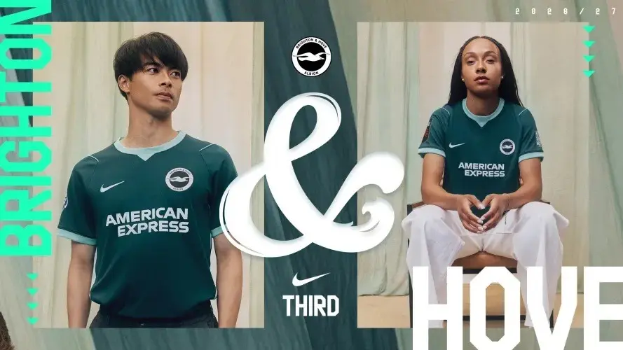
Brighton unveiled its Nike third shirt on 5 August. The concept links deep teal to the sea and surrounding downs, and lighter accents to the promenade railings.

Brighton unveiled its Nike third shirt on 5 August. The concept links deep teal to the sea and surrounding downs, and lighter accents to the promenade railings.
A closer look at the design
The catalogue image shows light turquoise around the neck, cuffs and side panels. The centre stays dark, with the sponsor and Swoosh in white. The circular crest adds another bright focal point near the top.
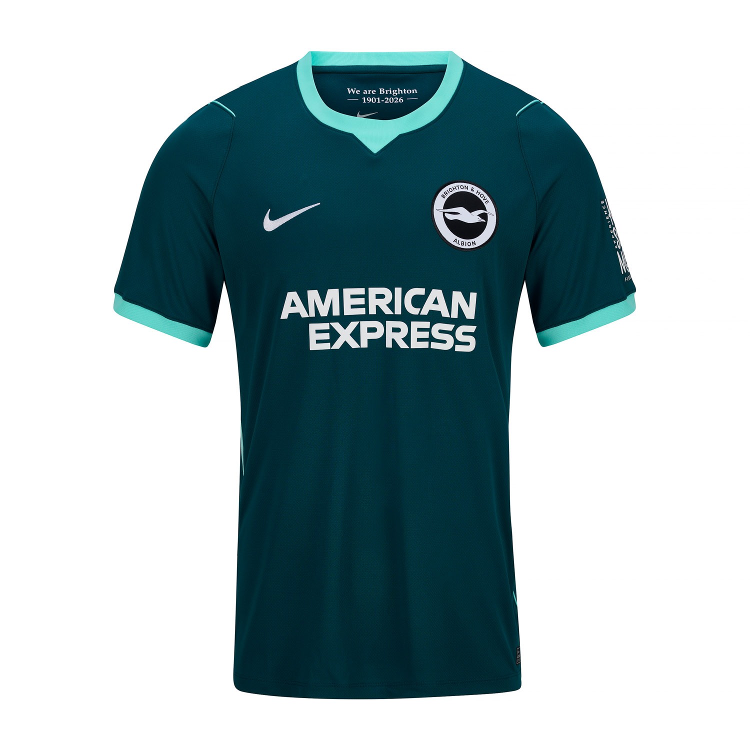
The side panels outline the silhouette without relying on a large print. Two intensities from the same colour family build the identity, with white reserved for the chest markings.
The catalogue’s Brighton 2026/27 third shirt shows this combination in the men’s version.
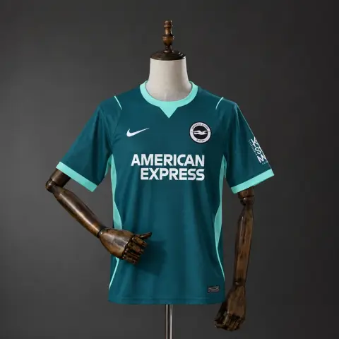
Matchtröja Brighton Tredjetröja 26/27 Herr
31,99 US$Se produkt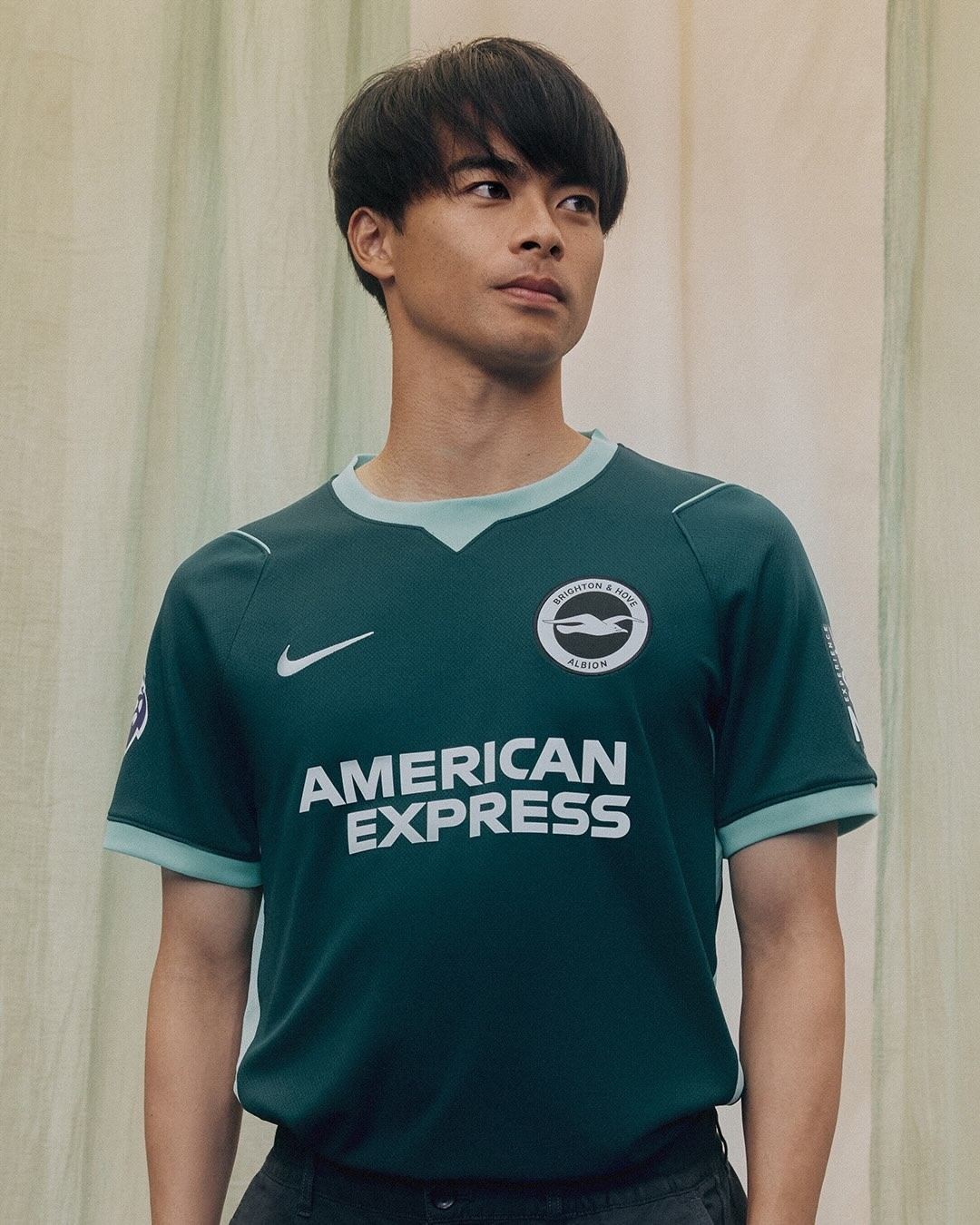
The design in context
The photograph helps compare colours and placement. For sizing or fabric, the relevant reference is that version’s description, rather than the specifications of a garment worn by a player.