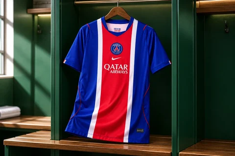
PSG 2026/27: the stripe that organises the shirt
A closer look at the blue, red and white composition of the catalogue model
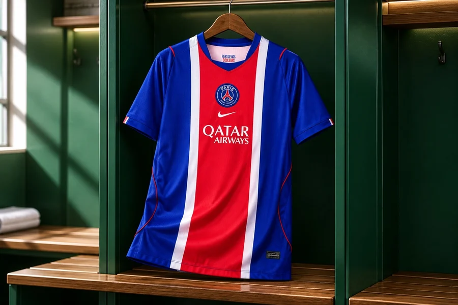

Sponsored content by Bota de Oro. Some shirts are recognised by how they distribute colour. On the Paris Saint-Germain 2026/27 model selected from Bota de Oro, a red stripe occupies the centre, two white lines frame it, and blue covers the sides and sleeves. Before any inscription is read, the composition already provides a clearly defined visual route.
The shop identifies this garment as the men’s home kit. This piece examines that specific item and does not present its image as match photography or evidence of a launch date. The distinction is useful: knowing a season’s name helps locate a shirt, but each version’s photographs and description establish what is being compared.
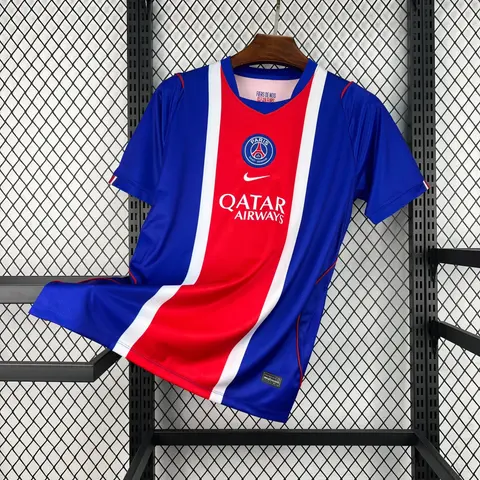
Paris Saint-Germain Home Shirt 26/27 · Men
$31.99See productA column of colour on the front
The red stripe connects the top with the hem. Its white borders do more than separate shades: they make the centre stand out even when the fabric folds. In the photograph, the crest sits on that central area with the mark below it. This axis gathers the most recognisable elements while the blue panels retain greater visual continuity.
The sleeves extend the blue, allowing the centre of the body to remain the focus. The collar repeats tones from the composition rather than introducing an unrelated colour. That concentration explains why the design can be expressive with a short palette: much of the effect comes from the stripes’ width and position, not from multiplying colours.
Observe proportions, not just symbols
When comparing similar shirts, look at the stripe’s width relative to the body, the crest’s position and the collar’s shape. Two items can share blue and red without distributing them in the same way. A frontal photograph helps establish those differences, while detail images allow visible finishes to be examined. Surrounding light can alter the perception of shades.
Outside a match setting, such a strong vertical composition works as the main piece in a simple outfit. Plain colours elsewhere leave the stripe to play its role. Repeating blue creates continuity, while a neutral shade highlights the whole garment. Each choice changes the balance without modifying the shirt or adding more symbols.
From design to product information
The cards on this page lead to the men’s model examined in Bota de Oro’s catalogue. There, the available photographs, description and size options can be reviewed before deciding. Price and availability belong on that updated page, not in this reading of the design. It is also worth distinguishing this version from player, children’s or long-sleeved garments that may carry a similar name.