Santa Clara 2026/27: from red to blue waves
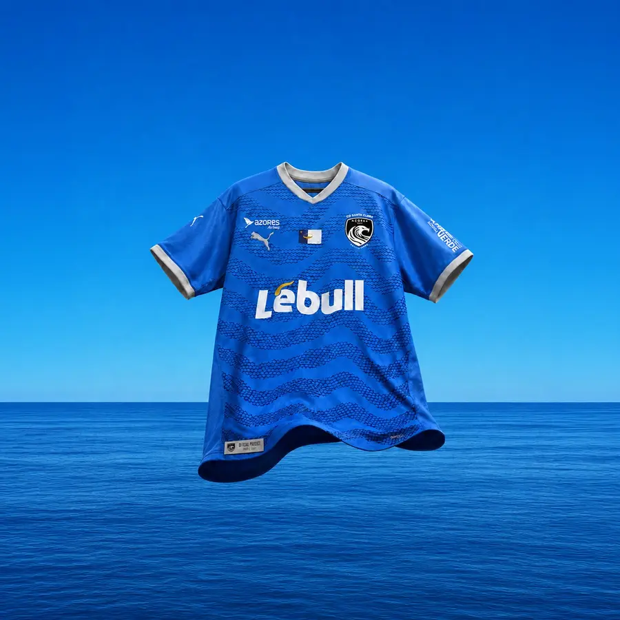
PUMA’s Santa Clara collection moves through red, blue and white. The three shirts share light emblems but change the rhythm and density of their patterns.
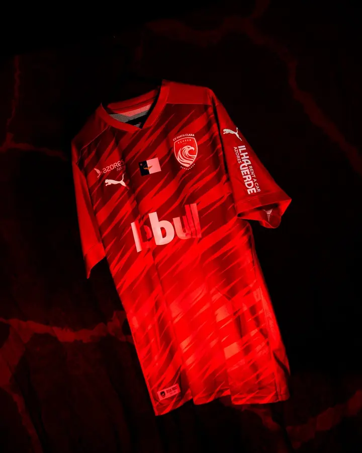

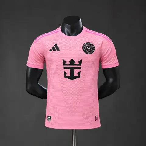
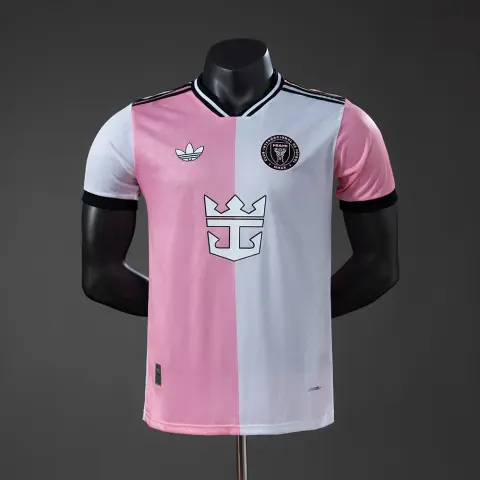
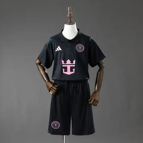
PUMA’s Santa Clara collection moves through red, blue and white. The three shirts share light emblems but change the rhythm and density of their patterns.
A closer look at the design
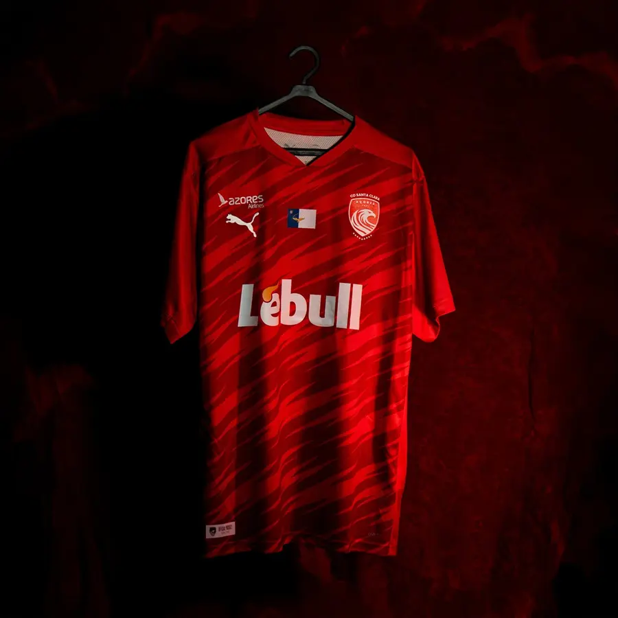
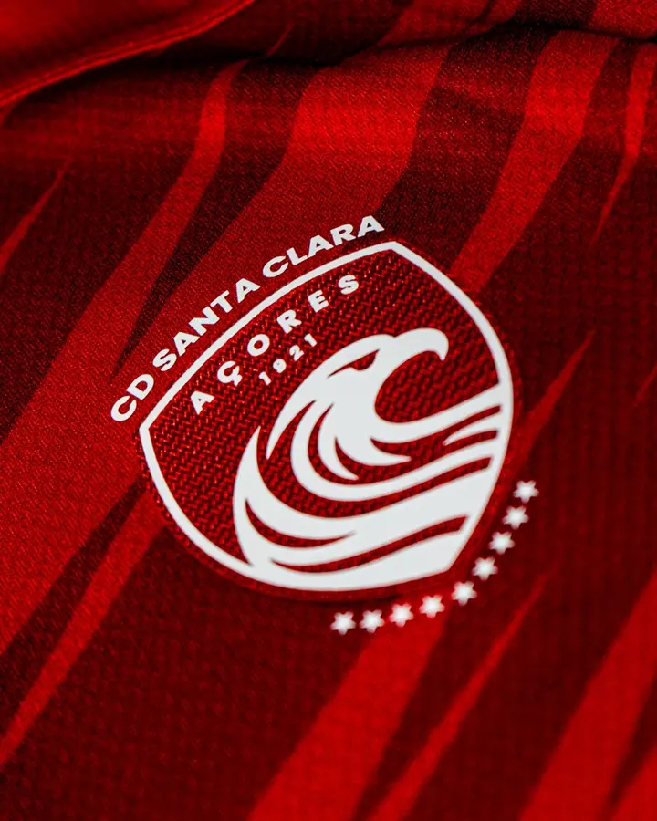
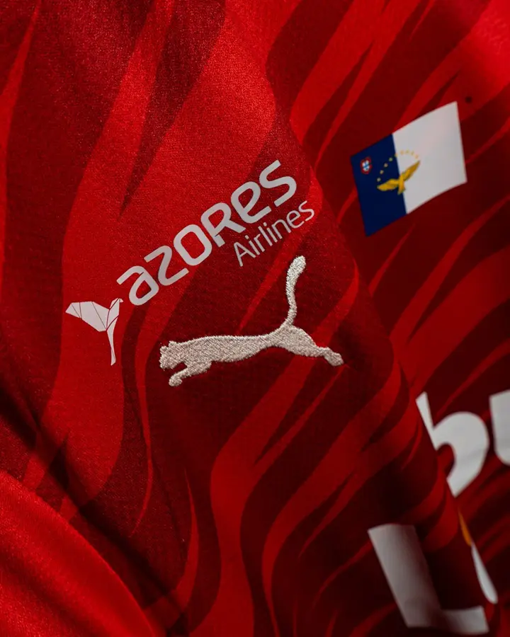
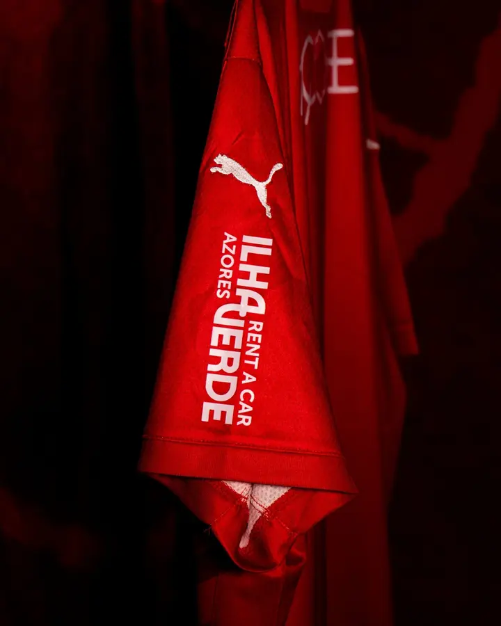
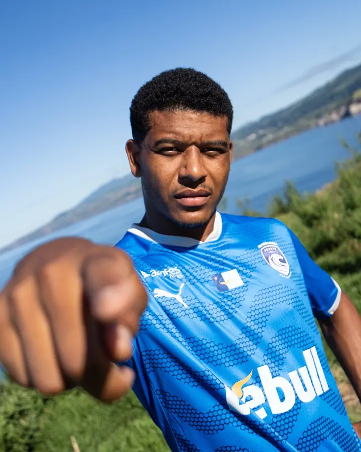
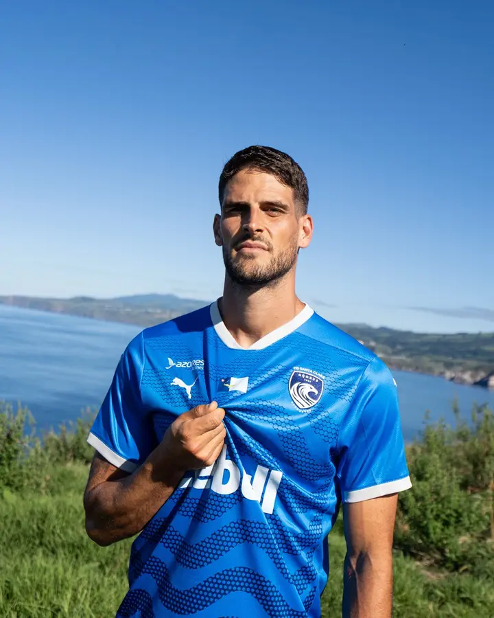
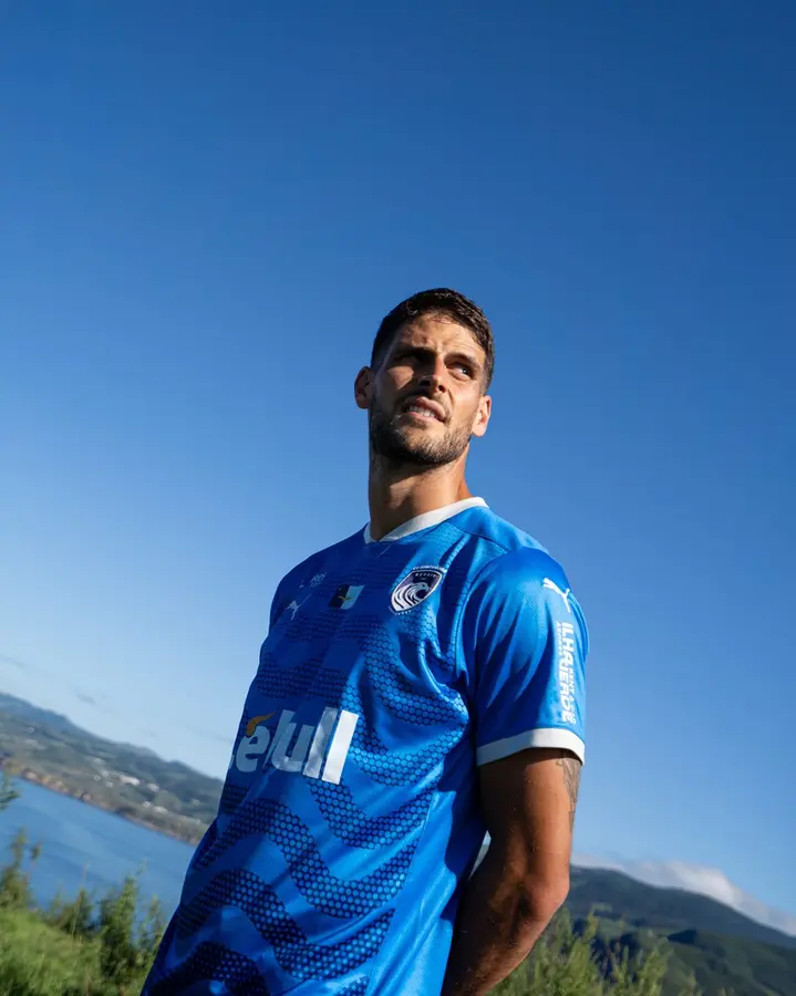
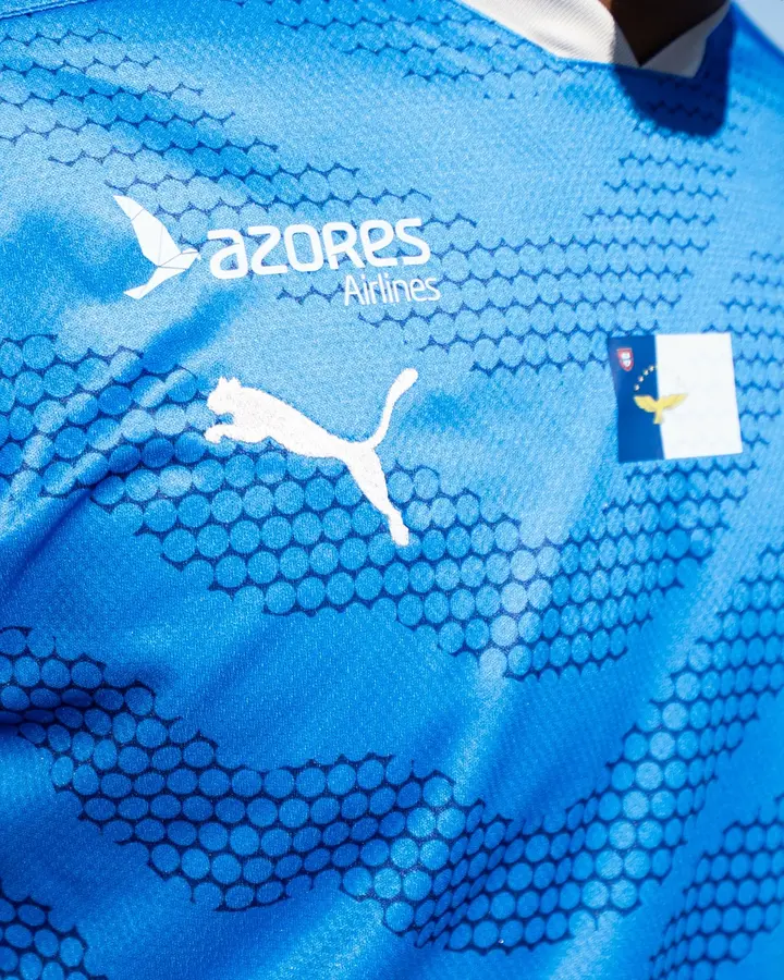
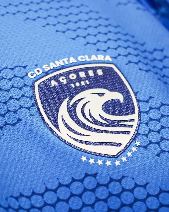
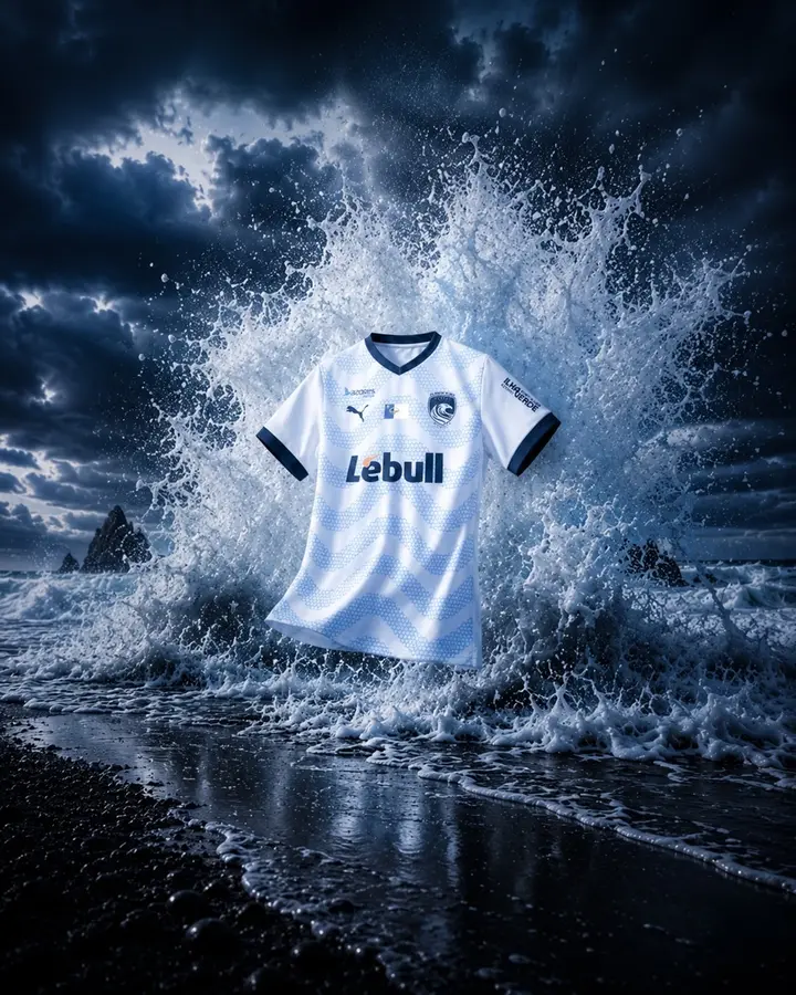
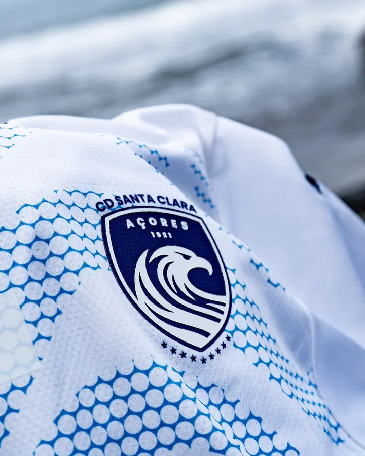
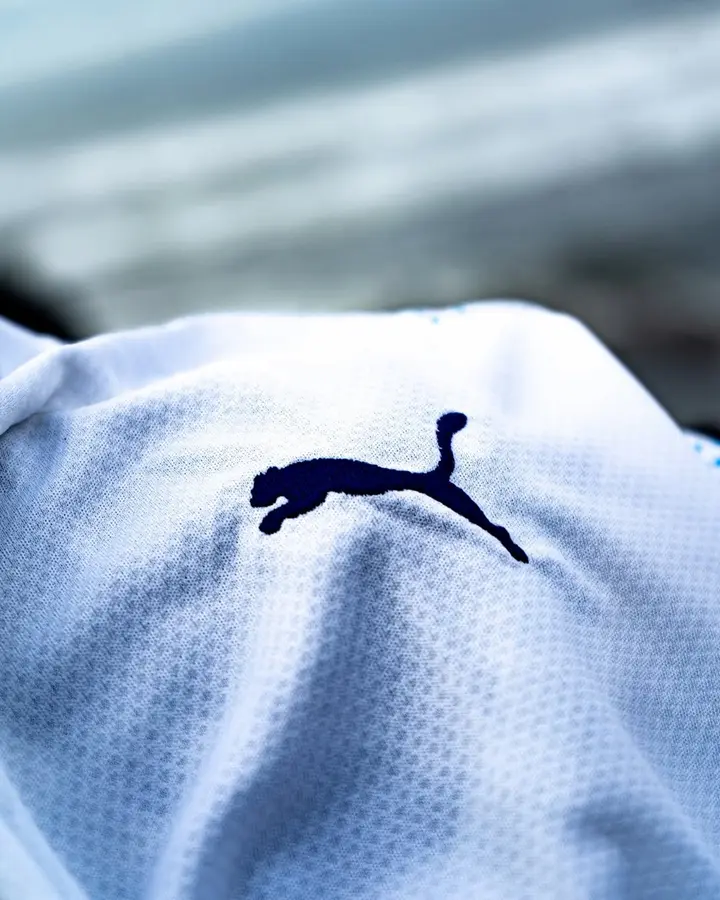
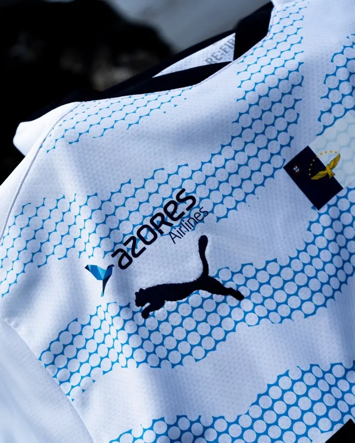
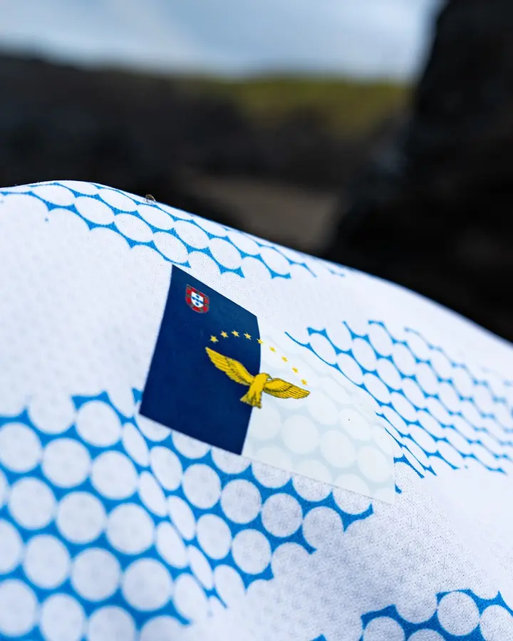
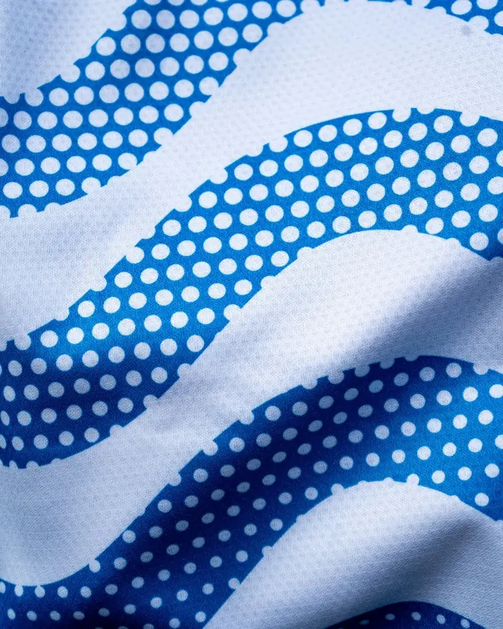
The first model uses two reds and angled strokes. Small repeated shapes build waves on the blue version beneath a pale collar. The third reverses the palette’s balance: white ground and blue waves. Fabric close-ups distinguish the pattern from reflections and shadows in the campaign photographs.
Comparing other Liga Portugal designs places this combination within a wider range of kits, while keeping seasons and versions distinct.
This retrospective revisits an earlier presentation; the photographs belong to the original launch.
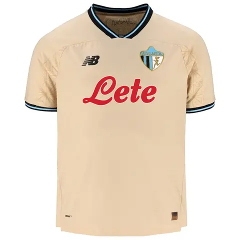
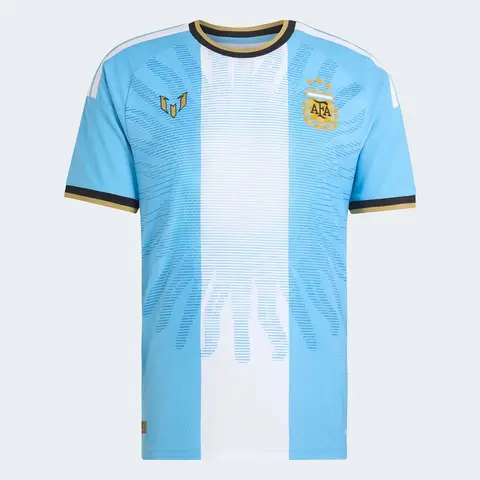
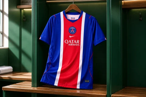
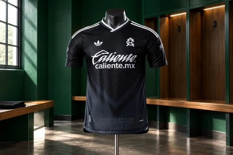
Kit gallery
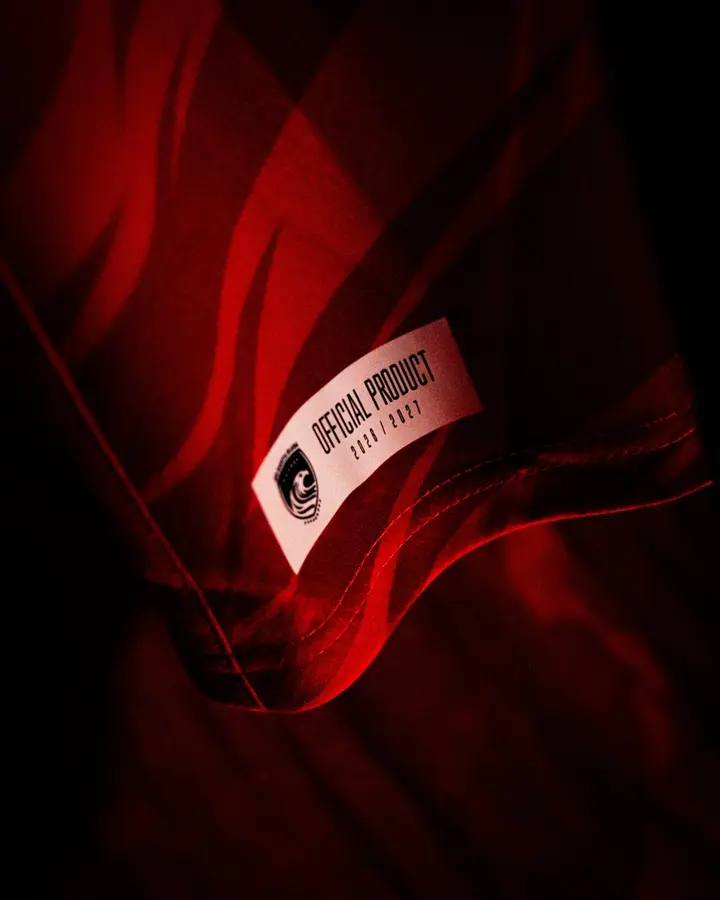
The gallery brings together the presentation photographs and available detail views. Appearance alone does not establish identical fabric, fit or technology across versions: those specifications depend on the individual garment.