Burnley 2026/27: cream and fine lines on the away shirt
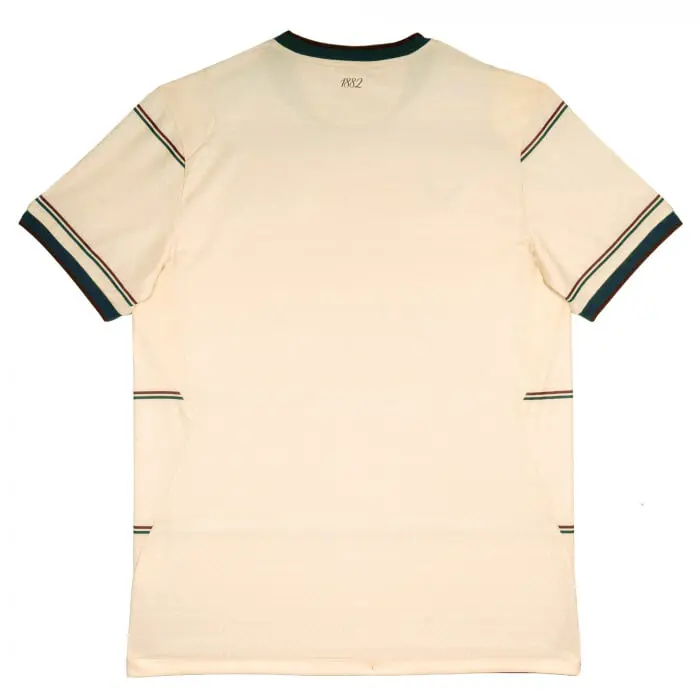
Burnley’s Castore away shirt has a cream base crossed by fine horizontal lines. The gallery brings together the front, back and full kit for comparison.
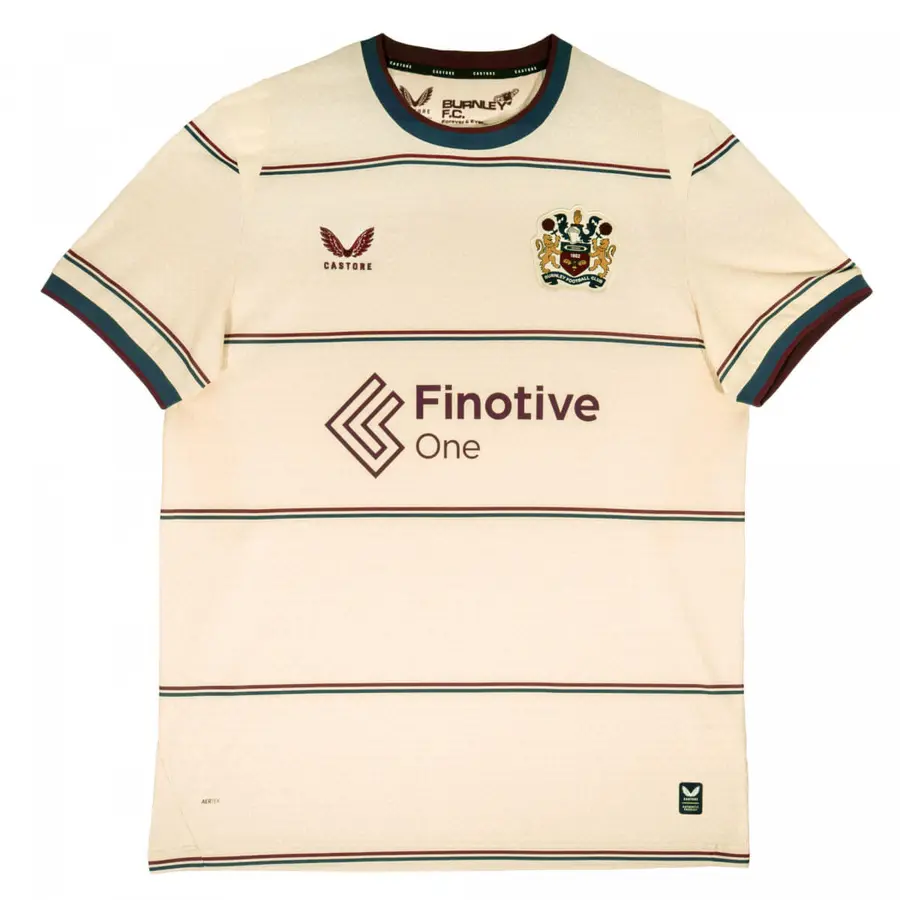


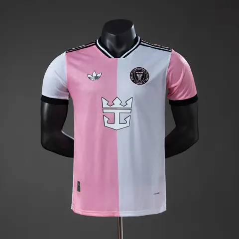
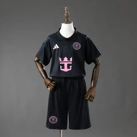
Burnley’s Castore away shirt has a cream base crossed by fine horizontal lines. The gallery brings together the front, back and full kit for comparison.
A closer look at the design
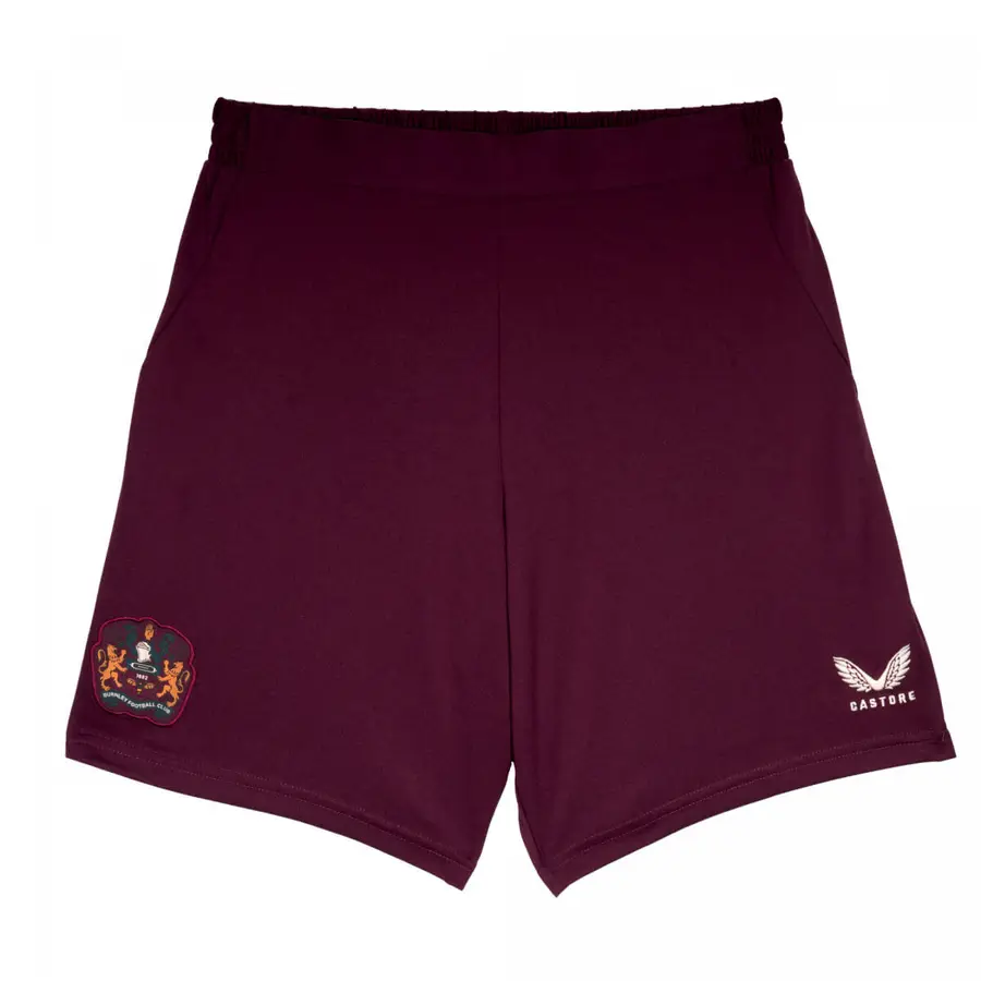
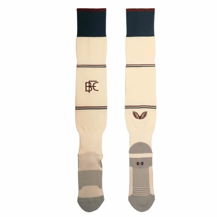
The spacing between the lines gives the main colour room to stand out. Dark finishes gather around the collar and cuffs, while the badge adds detail to the chest. Claret shorts provide a stronger block of colour; the socks return to the shirt’s cream.
Comparing other Championship designs places this combination within a wider range of kits, while keeping seasons and versions distinct.
This retrospective revisits an earlier presentation; the photographs belong to the original launch.
Kit gallery
The gallery brings together the presentation photographs and available detail views. Appearance alone does not establish identical fabric, fit or technology across versions: those specifications depend on the individual garment.